Inflectiv branding and media.
When promoting Inflectiv, it is essential to follow the subsequent guidelines, whether it be marketing communications, advertising, websites, articles and/or print media.
The mark on its own
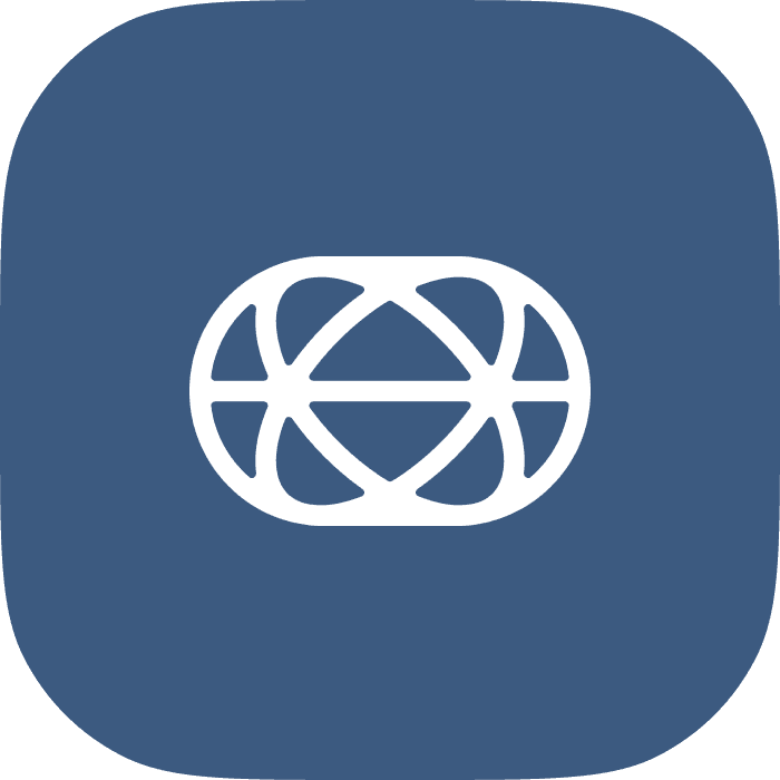
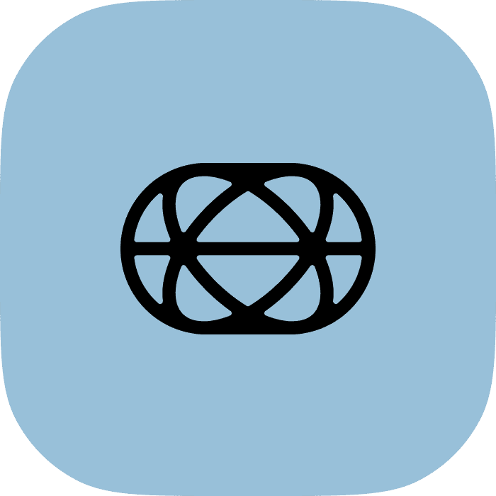
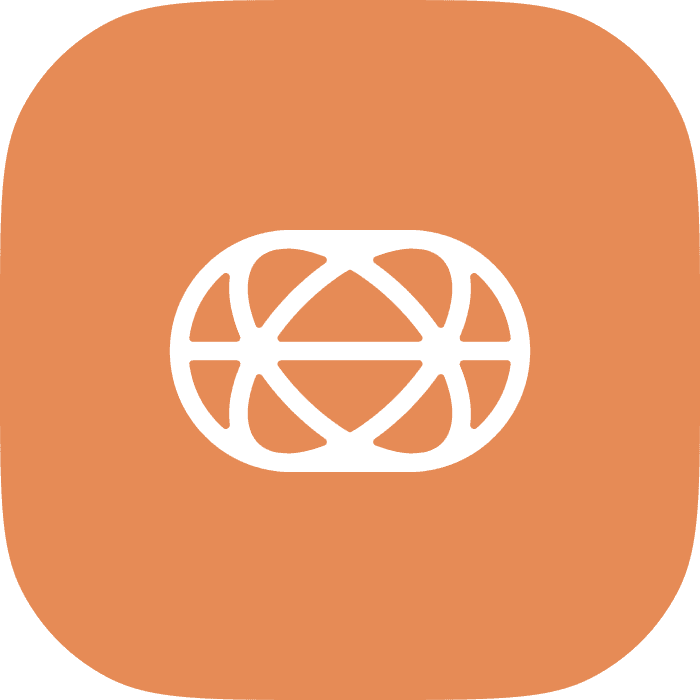
Four backgrounds, one shape. Use the version whose ground is closest to yours rather than recolouring it.


The mark with the name
The full lockup. This is the default in anything that is not already obviously ours.
Four things not to do to it
Do not stretch it, recolour it, rearrange the lockup, or set it on a ground it cannot be read against.
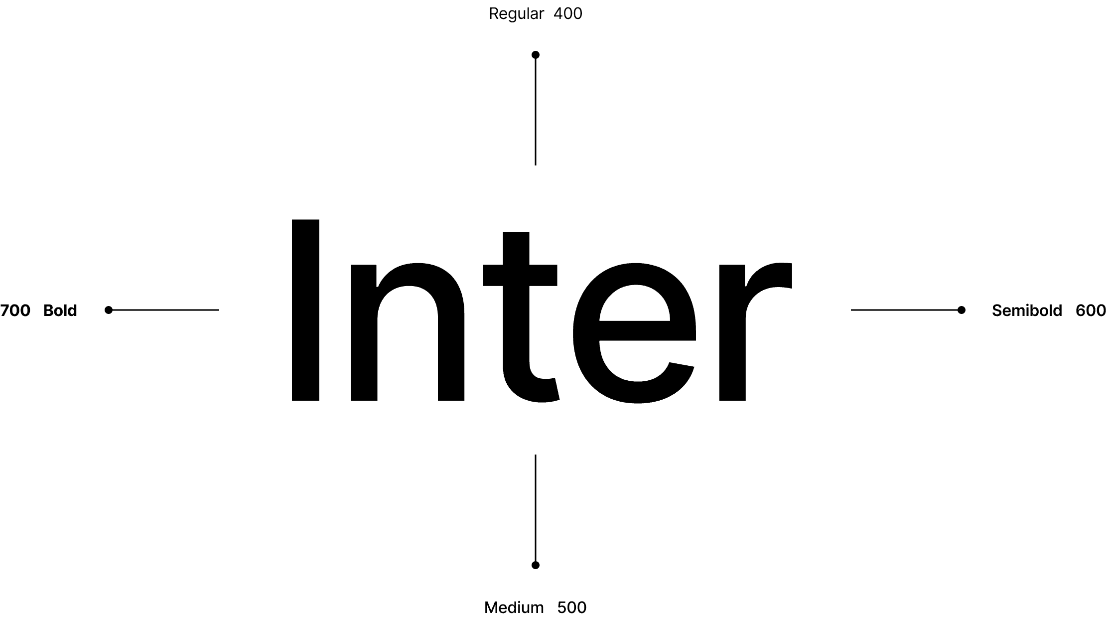
The palette, and the one typeface
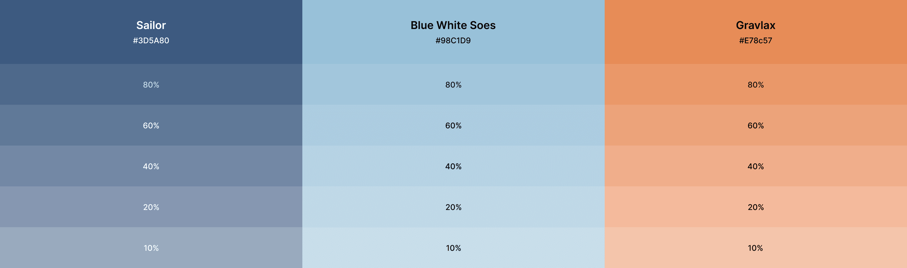
Sailor, blue white sees and grandex, at five tints each. Inter at four weights.
Colour and tints
Typography
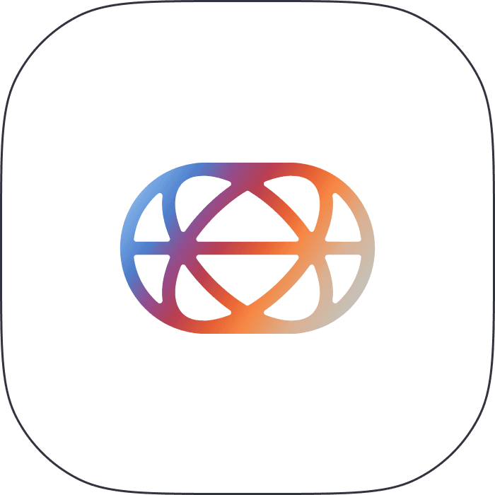
The mark at icon size
For app stores, avatars and anywhere the lockup would be illegible.
Press enquiries
For interviews, assets we have not published here, or anything that needs a person.

Official handles
- Website
- inflectiv.ai
- @inflectivAI
- Medium
- /inflectiv
Everything above, in one zip.
The brandmark, the logotype and the application icons, in every background variant on this page.